My media research is based on analyzing 3 magazine covers and 3 DVD/Video covers of a children’s TV Series. The 3 series that I have used are ‘The Simpsons’, ‘Doctor Who’ and ‘Bob the Builder’. The three series are not only different in appearance and content but also the mode of address to the audience, as in language and also the range of ages they’re addressed to.
These are the 3 DvD covers:
These are the 3 DvD covers:


These are the 3 magazine covers:


For example, ‘The Simpsons’ represent not only a cartoon; they also represent a collective identity as it is relevant in the title of the series. The magazine cover that I have looked at shows all the characters altogether, in order to impact on the audience and give a sense of unity but also different. Even though the series are addressed to a general audience, even a more adult audience, the picture denotes a decent image of ‘The Simpsons’ cartoons. Because the characters illustrated seem to have different ages, from the child to the grandfather, this fact makes the magazine even more accessible and even more comic than it actually is.
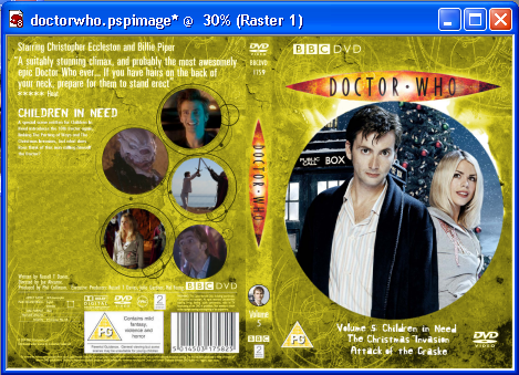
It creates a sense of mystery, having Homar as main character in the picture that seems to be puzzled. Similarly the Doctor Who cover creates a sense of enigma and makes the audience feel that something has happened or it is about to happen, by illustrating the Doctor with one of his companions starring harshly at the audience.
However, the genres of the two series differ in terms of conventions and impact on the audience. Whereas, The Simpsons create and atmosphere of amusement and good time, Doctor Who creates and atmosphere of excitement and confusion. For example, The Simpsons are perceived as a comedy whereas Doctor Who is considered to be a science-fiction/thriller series.
In The Simpsons picture, the characters are represented through cartoons in order to show that the people represented do not resemble exactly with the ones in real life. Even though the appearance seems to be alike the actual cartoons are more of an imitation to show that all of us are different on the inside. Diversely, the camera focuses on Homar but actually the purpose is that the audience should think he is analyzing us.
The different facial expressions of the rest of the characters show that all of they are individual and this relates to the genre conventions of a comedy where amusement and laughter have to be predominant.
The audience for these DVDs can be considered to be a very keen one, especially for the fact that the author has added ‘Collector’s Edition’, showing that the fans of the series get a bonus within this buy.
Another series of cartoons are Bob the builder that has been created especially to entertain children, by representing Bob the Builder and his team of machines. The picture on the DVD cover seems to inspire a lot of joy and happiness. The smiling faces create an impact on the audience because it shows how everyone is happy to do any job and help each other. This effect might be very helpful not only for children but also for parents because it encourages the little ones to be more willing to give a hand and be always nice and friendly to each other. The Bob the Builder series can be considered very educative because of the representation of the team as hardworking and ready any time for new adventures.
The sense of mystery is very relevant in the Doctor Who picture where the background relates to a special, science-fiction theme connecting to the characters and the title of the series. As much as the features of the picture relating to the genre also the audience to whom it is addressed differs. The general audience for the Doctor Who series is mainly teenagers because of the chance of escapism that the series offer.
In a similar way, the notion of adventure but at different ages is represented in both Bob the Builder and Doctor Who.
The title of the Doctor Who series is included in a weird shape, a picture of a sharp bulb which has become over the years the logo of the series. The Bob the Builder cover also includes a logo.
The contents of the DVD are listed at the bottom of the DVD cover which shows that they aren’t that significant. However, the titles have been carefully chosen as to imply one word referring to the supernatural.
Conversely, on the Bob the Builder DVD cover the title of the episode has been posted at the top of the picture, represented as sunshine, replacing the sun.
On the front cover of the magazine TV Guide 2004 edition are the Simpsons. Differently to the DVD cover, on the magazine cover are illustrated the majority of the characters of the series.
The Bob the Builder magazine is similar to the DVD cover as much in content as well as the title. However, the picture differs this time to the DVD cover, because it only presents Bob with one of the machines. Also, the magazine cover is divided in parts, to create more interest and offer more choice.
The language is also very simple and addresses to children in the same way and meeting the same conventions as in the DVD cover.
However, the ‘Doctor Who’ magazine challenges not only the conventions of the other two magazines but also the content. For example, it’s completely opposite to the presentation of the Bob the Builder magazine. Instead of the nice, enthusiastic and colourful presentation that the Bob the Builder magazine has got the ‘Doctor Who’ one has dark and gloomy colours, made to stand out by the touch of white.
Also, the magazine cover of Doctor Who is fuller and gives more subjects and choices to read for the audience whereas the DVD cover appears to be simple and empty. The background doesn’t change, compared to the DVD one, the sense of mysterious and enigma remains the same.
Because of the fuller content, the language can be considered more mature than on the DVD cover.
Equally, the Simpsons DVD cover is presented through a humoristic theme, addressing and making contact with the audience through the loop.
Other Dvds and Magazine covers that I have taken ideas from:


